Home Improvement Mintpaldecor is a home improvement approach built around soft mint and pastel tones paired with calm, minimal styling the idea is a home that feels quiet and fresh rather than busy or overly saturated. If you’ve been drawn to soft green-toned kitchens, pastel bedroom palettes, or that airy, “spa-like” living room look, that’s the direction this style leans into. This guide breaks down what the style actually looks like in practice, room by room, along with realistic budgets and the mistakes that most often derail it.
What Mintpaldecor Style Actually Means
At its core, Mintpaldecor combines three ideas: a mint-and-pastel color palette, minimal clutter, and natural materials that keep the space from feeling too sweet or artificial. It’s not about painting every wall mint green that tends to feel overwhelming rather than calming. Instead, mint and other soft pastels (blush, pale sage, soft sky blue) act as accents against a neutral base, the same way a designer might use one bold color sparingly rather than everywhere.
Three principles hold the look together:
- Restraint over saturation. One or two pastel tones per room, not five.
- Texture over pattern. Woven baskets, linen, matte ceramics texture does more work than busy prints in this style.
- Light, natural materials. Light wood, rattan, and matte metals pair better with pastel tones than dark, heavy furniture, which tends to fight the softness of the palette.
Building the Palette
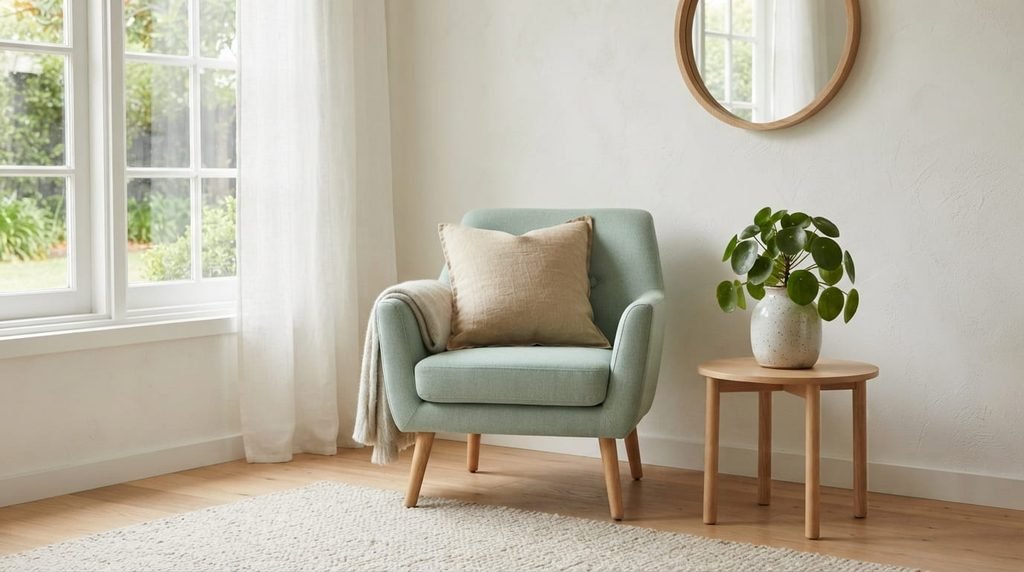
Core Mint and Pastel Tones
Mint itself works best as an accent color rather than a dominant one. Common ways to introduce it:
- A mint accent wall in a bedroom or home office, paired with white or off-white on the remaining walls.
- Mint-toned textiles a throw blanket, curtains, or a single upholstered chair rather than mint walls throughout.
- Ceramic or glass accessories (vases, planters, canisters) in mint tones, which are easy to swap out later if the style evolves.
Paired pastels that tend to work well alongside mint without competing: blush pink, pale sage, soft butter yellow, and dusty blue. Two pastels plus mint is usually enough; more than that starts to feel like an Easter display rather than a considered room.
Neutral Anchors
Pastels need a neutral base to read as calm rather than chaotic. Warm white, soft greige, or light oatmeal tones on walls and larger furniture pieces (sofas, cabinetry, bed frames) give the eye somewhere to rest. As a general rule, neutrals should cover roughly 60–70% of a room’s visual surface, with pastels and mint used for the remaining accents art, textiles, small furniture pieces, and accessories.
Metal and Material Accents
- Matte gold or brushed brass hardware tends to complement pastel palettes more warmly than cool chrome or stainless finishes.
- Light wood tones (oak, ash, light rattan) keep the room feeling airy; dark walnut or espresso-toned furniture can visually overpower a soft palette.
- Matte over glossy finishes generally read as more calming, which fits the overall mood the style is going for.
Room-by-Room Mintpaldecor Ideas
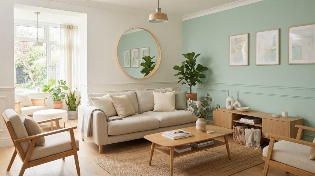
Living Room
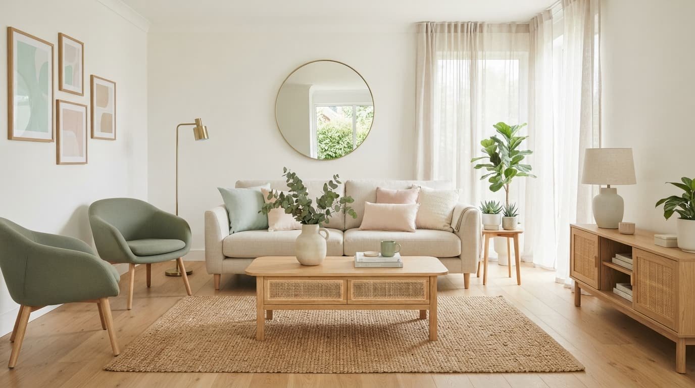
- A single mint or sage accent wall behind the sofa, with the remaining walls in warm white, keeps the room from feeling saturated.
- Layer in a mix of textures a woven jute rug, a linen sofa cover, a couple of ceramic vases rather than relying on color alone to create interest.
- Keep large furniture pieces (the sofa, any cabinetry) in a neutral tone, and reserve mint or pastel for smaller, swappable items like throw pillows, a single accent chair, or artwork.
- A large mirror or a piece of light-toned art above the sofa adds a focal point without adding visual weight.
Kitchen
- Mint cabinetry (upper or lower, not necessarily both) is one of the more committed ways to bring the style in pair it with white or butcher-block countertops to keep the overall look light.
- For a lower-commitment option, mint or pastel accessories a stand mixer, canisters, dish towels introduce the palette without any renovation work.
- Brass or matte gold cabinet hardware complements mint cabinetry particularly well.
- Open shelving in a light wood tone works well here, since it keeps the kitchen feeling airy rather than boxed in, which supports the overall calm aesthetic.
Bedroom
- A mint or blush accent wall behind the headboard is one of the most common and effective ways to apply this style, since bedrooms are typically smaller and easier to commit fully to a palette.
- Layered bedding in soft neutrals with one or two pastel accent pillows keeps the bed from looking flat while still feeling calm.
- Linen or cotton curtains in a soft neutral let in natural light, which matters for this style natural daylight tends to make pastel tones look fresh rather than dated.
- Avoid heavy, dark furniture in this room specifically; light wood nightstands and dressers keep the palette from feeling weighed down.
Bathroom
- Mint or sage tile as a full accent wall, a shower surround, or just a backsplash is a strong, distinctive choice for this style, since bathrooms are naturally smaller and easier to fully commit to a palette.
- White fixtures paired with brushed brass or matte gold faucet hardware complete the look without requiring a full remodel.
- Because bathroom updates often involve plumbing, tile work, or electrical fixtures near water, check local building code requirements and consider a licensed contractor for anything beyond cosmetic swaps like towels, a bath mat, or a mirror frame.
- Soft, rounded ceramic accessories (soap dishes, tumblers, trays) reinforce the calm feel better than sharp-edged or industrial-style pieces.
Home Office
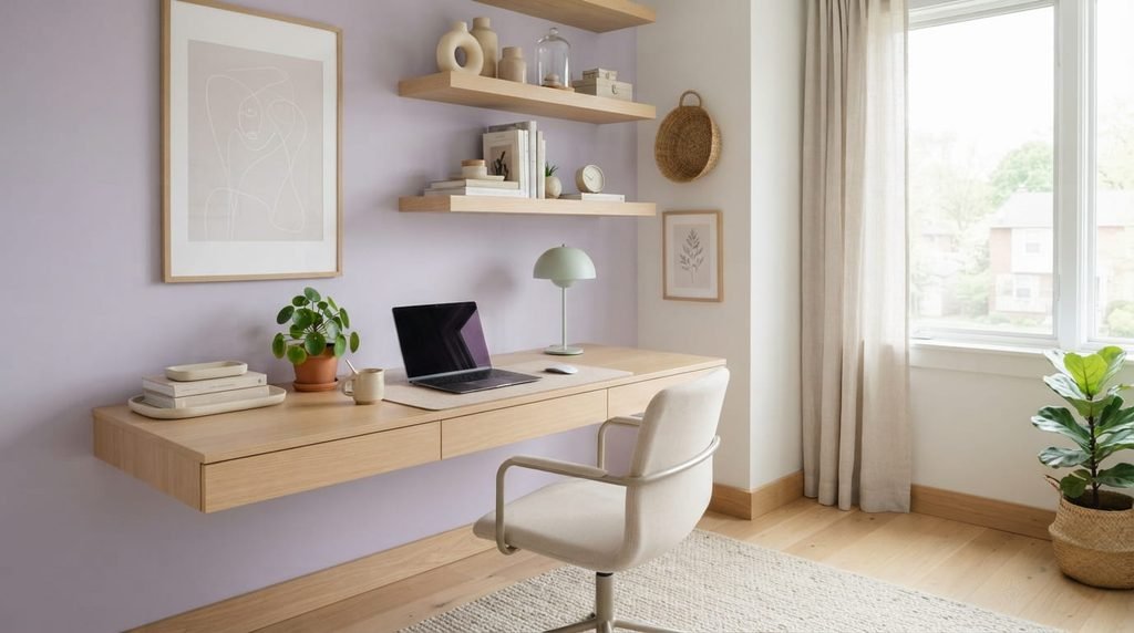
- A mint or sage accent wall behind the desk gives the space personality without becoming distracting during video calls.
- Light wood desks and shelving keep the workspace feeling calm rather than corporate.
- A single pastel-toned task lamp or desk accessory is often enough overdoing pastel in a workspace can start to feel more decorative than functional.
Lighting for a Mintpaldecor Space
Lighting has an outsized effect on how pastel tones actually read in a room, more than most people expect when choosing paint.
- Natural light is the biggest factor. Mint and pastel tones tend to look their best in rooms with strong natural daylight; in rooms with limited natural light, these tones can look muted or slightly gray rather than fresh.
- Bulb temperature matters. Warm white bulbs (around 2700K–3000K) can shift cooler pastels like mint toward a slightly yellow cast, while cooler bulbs (3500K+) keep mint and blue-based pastels looking true to color. It’s worth testing a bulb in the actual room before committing to a full lighting plan.
- Layered lighting an overhead fixture plus a table or floor lamp softens shadows and keeps the room feeling calm in the evening, which supports the overall mood of the style.
- Direct fixture swaps on existing wiring are typically straightforward DIY projects; any work involving new wiring or moving electrical components should go to a licensed electrician.
Textiles, Materials, and Finishes
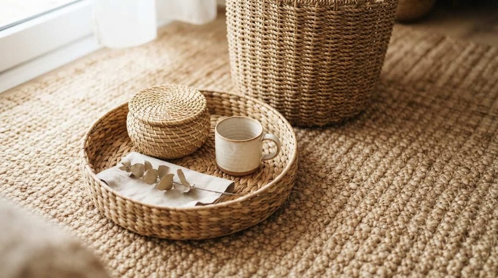
- Linen and cotton in soft neutrals or pastel tones support the airy, uncluttered feel central to this style better than heavier or more textured fabrics like velvet, which can visually weigh a room down.
- Woven natural materials jute rugs, rattan furniture, seagrass baskets add texture without adding color, which helps balance a room that’s already carrying pastel accents.
- Matte ceramic and glass accessories (planters, vases, trays) fit the aesthetic more naturally than high-gloss or heavily patterned pieces.
- Plants particularly ones with soft, rounded leaves rather than spiky or architectural shapes reinforce the calm, natural feel and pair well visually with mint tones specifically.
Common Mistakes to Avoid
- Using mint as the dominant color everywhere. Mint on every wall in every room tends to feel more like a themed nursery than a considered adult space. Treat it as an accent, not the default.
- Mixing too many pastels at once. Combining mint, blush, lavender, and yellow all in the same room usually competes rather than complements. Stick to one or two pastels alongside mint per room.
- Ignoring natural light before committing. A mint accent wall chosen under warm artificial light can look noticeably different once you see it in daylight always test paint on the actual wall across different times of day.
- Pairing with the wrong furniture tone. Dark, heavy furniture (deep walnut, black metal) tends to clash with the airy quality this palette is going for; light wood and matte metals are a more natural fit.
- Skipping neutral anchors. A room with no neutral base just pastel on pastel can feel busy rather than calm, which defeats the purpose of the style.
Budgeting a Mintpaldecor Refresh
- Under $50: Mint or pastel accessories vases, dish towels, a throw pillow, small planters. A good starting point for testing whether you like the palette before committing further.
- $50–$300: A single accent wall in mint or sage, a set of pastel bedding, a woven rug, updated cabinet hardware in matte gold or brass.
- $300 and up: Mint kitchen cabinetry (paint or reface, not necessarily full replacement), a tiled bathroom accent wall, a statement light fixture, or a reupholstered accent chair.
Starting with accessories and one accent wall is a reasonable way to test whether the palette suits your space and your daily life before investing in anything more permanent, like cabinetry or tile.
Maintaining the Look Over Time
- Pastel and mint-toned painted surfaces can show scuffs more visibly than darker colors; a washable matte or eggshell finish makes touch-ups easier in high-traffic areas.
- Light-colored linen and cotton textiles typically need more frequent washing than darker fabrics to keep the “fresh” quality that’s central to this style.
- Because the palette relies on a light, uncluttered look, keeping surfaces relatively clear day to day matters more here than in busier, more maximalist styles clutter tends to undercut the calm effect more noticeably against a pastel backdrop.
Home Improvement Mintpaldecor: Frequently Asked Questions
Is Mintpaldecor the same as “sage green” or “cottagecore” decor?
It overlaps in using soft, natural-feeling tones, but Mintpaldecor specifically centers mint as an accent color within a broader pastel-and-neutral palette, rather than being tied to a rustic or vintage aesthetic.
Will a mint accent wall feel dated in a few years?
Using mint as an accent rather than the dominant color reduces that risk, since it’s easier and cheaper to repaint one wall or swap textiles than to redo an entire room.
What paint finish works best for a mint accent wall?
Matte or eggshell finishes are generally recommended for walls in this style, since they show fewer imperfections than gloss and complement the soft, non-reflective quality of the overall look.
Do I need to redo my whole kitchen to get this look?
No cabinet hardware, accessories, and a partial accent (like an island or lower cabinets only) can introduce the palette without a full renovation.
What’s the biggest mistake people make with pastel-heavy decor styles?
Using too many pastel tones at once without a neutral base to anchor them, which tends to feel busy rather than calm the opposite of what the style is going for.
Conclusion
Mintpaldecor works best as a restrained, accent-driven approach mint and one or two supporting pastels layered over a neutral base, with light materials and natural textures doing the rest of the work. Starting small, with accessories or a single accent wall, is a practical way to test the palette in your actual lighting before committing to anything bigger like cabinetry or tile.
Related resources: Renovation Tips Decoradhouse: The Realistic Guide to Planning and Sequencing Your Home Update · Modern Home Exterior: 25 Ideas, Colors, Styles & Renovation Tips